
SMIOTA
UX / UI Design for package tracking application at every touchpoint
My Role
UX Designer And UX Researcher
Tools
Sketch, Invision, Figma, Paper/ Pen
Key Skills
Onsite Visit , Feature Analysis, User Persona Creation, Prototyping, High Fidelity Mockups
Deliverables
Responsive Web App
Project Team
2 UX/UI Designers, 1 UX Researcher, 1 Project Manager,
2 UI developers, 1 backend engineer, 1 VP of Engineer
Process
This is the process which I followed while starting to work on this project. Following this process was very helpful in every step to carry out this project in the most organized and effective way.
DEFINE
Overview
Smiota is a startup that offers package tracking and storage solutions for colleges, medium to large scale businesses and residential properties.
Challenge
A central off-site mailroom application is needed to help tackle the most complex package and mail delivery challenges. An application has to be designed which can help to do the following:
Design and manage workflow of the mailroom employees
Create custom package statuses
Set allowed transitions of the packages
Provide special instructions for packages and recipients
Though this application will be used by many of Smiota’s clients and will be customised accordingly, this particular project was taken into 3 month sprint process to rope in FACEBOOK as our client.
How Might We..
Designing the mailroom application around the ‘Chain of Custody’ concept where every transfer of evidence from person to person is documented and is provable.
SOLUTION
A final set of high fidelity designs of ‘Mailroom Pro’ were delivered along with prototypes, well researched plan and
usability test results
DISCOVER
User Persona | Research - Onsite Visit (Pain Points And Key Findings)
USER PERSONA
Mailroom staff / employees
The main users of the Mailroom Pro app will be the mailroom staff/employees.

Key responsibilities of a mailroom manager
RESEARCH
User research was quintessential, in order to understand the user needs better. Various research methods were used which helped me with great insights to make smooth and hassle free user experience for the users.
After collaborating with the marketing, customer service, product manager and QA teams, I got a fair idea and understanding of how the previous smiota mailroom standard app worked.
The basic process is as follows:
Once the basic process was clear, the next step was to approach our end users to know their pain points.
On Site Visit
I along with my VP of engineer and dev team visited the mailroom warehouse of FACEBOOK. This step in the research process was very crucial as we got to know the pain points of our users which further helped us with detailed insights to design mailroom pro app.
The onsite visit was basically to understand the 'Arrival' to 'Delivery' needs of the user and the current flow which mailroom staff uses.
In order to prepare for our onsite visit, we roughly prepared a set of questions which needed clarifications and were of prime importance in order to understand the overall needs for designing new solution.

IDEATE
Feature Analysis | Key Strategies | Client Configuration | Style Guide
Feature Analysis
After gathering all the data, I got a clear view as to which features were important to be a part of MVP process. Therefore I started listing down all the important features after analyzing the data which would make a way into the final design solution.
Key Strategies
In order to make ‘Mailroom Pro’ more powerful and useful some of the key strategies are as follows
Client Configuration
With all the research in hand, I explored many ways that Smiota was serving their customers and I ended up finding 6 "configuration types" that they were supporting, with a bunch of smaller customizations tailored to each client. For the purposes of the Mailroom Pro, we decided to focus on the large scale business configuration since we were pitching in for a huge social media client, like Facebook.
Key Modules
Based on all the ideation and discussion with the team, I realized that the Mailroom Pro app had more in depth modules to be designed. The key modules were as follows:-
1) Arrival Packages (Mobile)
2) Receive Packages (Web)
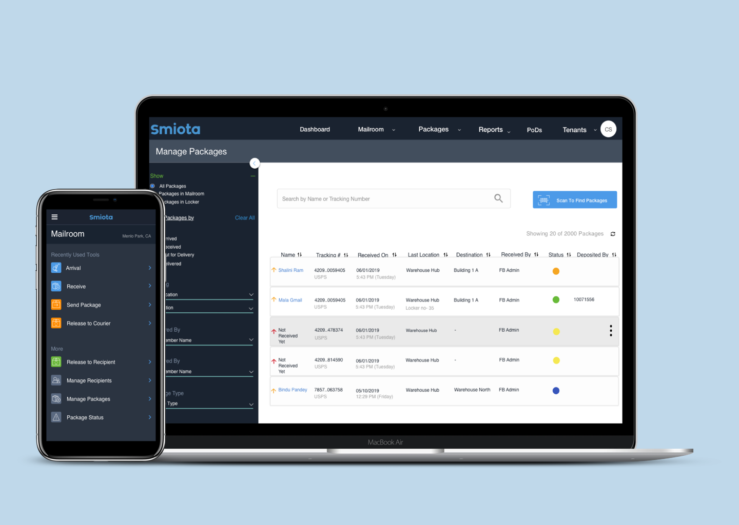
3) Manage Packages (Web)
4) Release Packages (Mobile)
5) Dashboard And Settings (Web)
PROTOTYPE AND TEST
Constructing Solutions| Iterations | High Fidelity Mockups | Testing
Constructing Solutions
At this stage, I was joined in by another UI/UX designer on board who was hired as the company was expanding. In order to meet the project goals on time, project manager got new designer to be a part of this project.
I discussed and shared all the information, research, initial designs/sketches with him. We both collaborated on this project seamlessly to achieved the desired results. We were given to lead different modules in order to finish the designs and deliver on time.
In this section I will highlight the modules designed by me. Each of the module have had 2 sets of design, 1st version which got tested and 2nd version was final with implemented changes
Arrival
The main goal on the package arrival process is getting off packages from the truck and getting into the systems as quickly as possible. In order to achieve this, we designed an interaction that stores the package data locally in the browser and tries to sync to a server on a 2 second interval. This helps the staff to focus on the task of scanning packages quickly and getting into the systems and worry less if they are using the software correctly.

Home Screen
Change # 1 : Tweaked the word from courier arrival to ‘Arrival’. This gives the user better clarity on the exact stage at which package is in.
Change #2 : Since Role authorization was also being integrated in the final design, the location information, instead of building location has been changed to main location
Change #3: Scan icon used to reduce confusion. It gives clear call to action to scan the packages once its been delivered by the courier service
Change #4: More personalized touch with the text which eliminates ambiguity
Change #5: Clear messages enabled which lets the user know the current state of action
Scanned Packages
Change # 1 : Clearly showing the package status along with the location and the current package which is being scanned
Change #2 : Clear content as to total no of packages scanned, with error information if any, also showing the continual attempt of the package to sync to the server
Change #3: Clear icon of the package sync to the server
Change #4: Automated synced packages accepted shown replaced with the icon

Prototype
Key technicalities taken into consideration at Arrival stage
Quick scan at arrival
Prevention of the same packages scanned twice
Use tracking number as the unique identifier
Edge case of the same tracking number applied for multiple packages?
If so, confirmation pop up to confirm that this is the intent
Receive Packages
Once all the packages are scanned in the system at arrival point, packages are received on desktop. Therefore a web version is designed for this. In this step, packages can be set on various statuses too, like for example, the package can be set in transit status. Below find high fidelity mockup screens of RECEIVE STANDARD flow according to the needs requested by the users.
Change # 1 : Better clues added along with features / information like ‘view history’, ‘special instructions’ and ‘package arrival time’ on the left side of the page
Change #2 : ‘Required information’ titled which gives a better understanding to the user as to which are the important fields to be filled in for successful storing of package information
Change #3: Under the Deliver To section, ‘Set Status’ field is added where the users can set the exact status of the package which is one of the most important feature which we analyzed for ‘tracking chain of custody’
Change #4: Changed the term ‘Organization’ to ‘Company Name’. A small but important change to give an empathetic and friendly approach towards the user
Change #5: Clear call to action buttons along with icons designed for easy recognition through visuals
Change #6 : ‘Review And Print’ option given to review all the information once before printing. Also how many number of packages are saved information is given at the bottom of the page for easy understanding
Prototype
Key technicalities taken into the consideration at receive stage
Building a mechanism to update package status
Alert feature to let the staff know if the same tracking number is scanned twice
Ability to enter package in the system if it is not scanned during the arrival stage
Ability to provide special instructions for the package
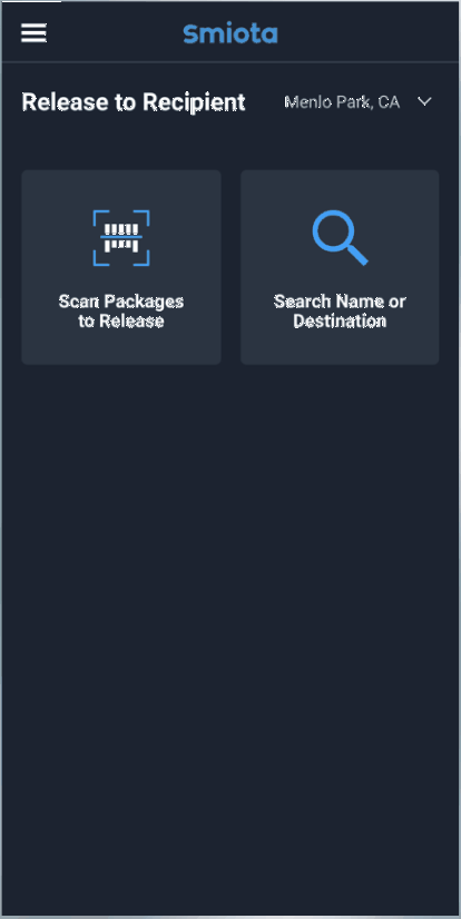
Release Packages
Once all the packages are set in different statuses and received successfully, packages are ready to either be in transit mode or in delivered state. Kindly find below how the release module will be seen on the phone screens. Below find high fidelity mockup screens of DELIVERED / RELEASED flow according to the needs requested by the users.
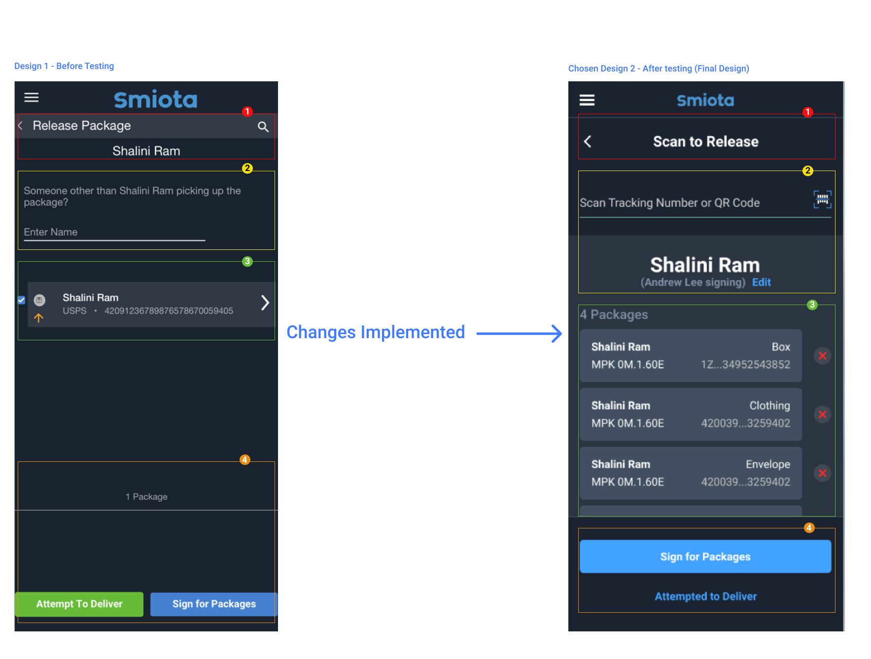
Change # 1 : Clear instructions with header, ‘Scan to Release’
Change #2 : Just below the header, the space to take the action, in this case-’scanning’ the package with icon is provided which will autofill the tracking number once the package scanned, or QR code scanning technology can be used
The recipient name is mentioned in bold. to whom the packages belong to. Also the name of the other person receiving the packages on behalf of the recipient is mentioned with edit button placed on the side, which helps the user to make any changes if needed.
Change #3: All the package details like box type, building/location to be delivered, tracking number etc is added. Also the cross icon, suggesting deleting the
package is added
Change #4: Term ‘Sign for Packages’ is stated as clear call to action button as it is highlighted first
Prototype
FINAL RESULT

85%
Process Improvement
5
New clients on board
1000s
Satisfied And Happy customers
By designing the Mailroom Pro application, I contributed to launching a successful product in this startup. My designs are currently being used by thousands of mailroom employees and it helped increase revenue brought into the company. My contributions throughout had a direct impact on company profit
Project Learning
Working on this project was a surely an enthralling journey for me. This was one of the most demanding project during my time in this organization. In the course of researching the mailroom app process at the client’s mailroom warehouse, I came to understand the entire process of how the mails get received to the point of delivery at the desk/doorstep of its employees. I gained lot of knowledge of how mailroom warehouses run.
I also learnt that Collaboration is key. Collaborating with the developers and project manager, I was able to focus on how the users would interact with the new app. Learning the key difference of how the existing app was used vs how the new app would be used was huge. This was possible because we as a team were very passionate of bringing this new design to our users. I worked closely with the project manager to make sure my contributions of the UX perspective were cohesive and easy for the developers to implement the design solutions. We had more work to do based on the requirements of the users. I realised that once we had web application ready, some parts of the process were purely handled on mobile device. Therefore we developed this further into android / IOS app too.
My contract with the company came to an end after working on various projects for a year. We as a team only had 3 months to design and develop this application successfully. The good news is, currently the design is being used by the clients and is running successfully. I feel on cloud nine when I finally witnessed my design being shipped successfully and the company got client like Facebook onboard.