

HISTOR
UX / UI Design for a paint application to improve the color buying experience

My Role
UX Designer and UX Researcher
Tools
Figma, MS Teams, Devops Azure, Mural, Pen / Paper
Key Skills
User Research, Feature Analysis, Research Synthesis, Persona Creation, Prototyping, Ideation, Mockups, Stakeholder Management and Presentations
Deliverables
Responsive Mobile App Design
Project Team
2 UX/UI Designers, 2 Researchers, 1 Product Manager, 3 Front End Developers, 1 Backend Engineer, and 1 Scrum Master, Stakeholders (Histor)
Methodology
Agile / Scrum
Process
DEFINE
About
Histor - My Color App is a native paint application app of PPG industries serving clients in Netherlands and Belgium. It is for the homeowners who are looking to paint their spaces and get omni-channel color experience that will help them to find the right colors for their living spaces and drive to the next step in their painting journey.
Problem
Choosing a paint color for the interiors have always been a difficult task for our users. The choice of choosing a color over a white wall is always time consuming and challenging. In this project, the challenge was to create and produce Histor app for the homeowners which will help them to experience an exciting journey of choosing paint colors for their interiors and help them ease their painting journey experience.
How Might We streamline the process of selecting paint colours for homeowners, particularly addressing the challenges of time consumption and decision making difficulty, in order to enhance their painting journey experience with the Histor Application?
Simplified & Enhanced painting journey experience
-Solution
A comprehensive set of high-fidelity designs for the Histor Color Application, accompanied by prototypes, a meticulously researched plan, and usability test results were delivered in the end. This solution aimed to provide users with a seamless experience in selecting paint colors for their spaces.
DISCOVER
A thorough RESEARCH processes implemented to uncover user needs and make informed decisions for the development of the ‘HISTOR’ app
During the discovery phase, a thorough examination of the customer journey was conducted to gain insights into users' needs when selecting paint colors for interiors. PPG collaborated with GFK, a marketing research company, to understand the journey of consumers interested in colored wall paint compared to those opting for white wall paint.
The Color Squad, in collaboration with Histor stakeholders, scrutinized the Customer Journey to gain deeper insights into user needs. Through this process, the target customers for the research were identified as Functionals or Creatives seeking to paint with color.
Discovery Research
Customer Journey Review
Customer Journey Review
Discovery Interviews - Session 1

After we got some idea about the customer journey who chose color to paint their walls, we decided to take our next step to understand our users, through Discovery Interviews. The sole purpose of this activity was to just understand the challenges and pain points that they face around a painting project in their house. This is how I designed the session for the Discovery interview.
Discovery Interview was based on some assumptions which we had built as a team. These assumptions were built with our understanding from the market study conducted by GFK.
Session 1 : Discovery Interviews
M1 Assumptions
What our users felt about different assumptions…


M1 Assumptions

Findings 1
Here are the list of assumptions we had before interviewing our users. The goal was to see which assumptions from the list can be validated, Invalidated and which will remain Uncertain
Next Steps
Continue to explore non - validated M1 user assumptions
Create M2 solution- based assumptions
Work with participants to determine potential solution direction with ‘Buy - a - feature’ exercise

M 1 : Assumptions
Findings
Below is the list of findings from the discovery interviews condcted. The list shows findings divided into assumptions which are ‘Validated, Invalidated and what were their outcomes and uncertain assumptions which were neither validated nor invalidated by our users.
Painting Projects
Visualizing in a Room
Trends
Digital Solutions

Persona 1
Painting Projects

Persona 2
Personas
Once we finished our Discovery interviews and findings, we figured out the personas / users of our product. We realized our users are divided into DIFM (Do it for me) and DIY (Do it yourself) types.
Session 2 - Buy A Feature

This activity ‘Buy A Feature’ was conducted so that it could help us prioritize the features for our initial design version. In the end of this activity the features which users valued most were revealed. This activity made it all worth to help us bring closer to create solutions related to our M1 assumptions findings.
Before we jumped into this activity, we made list of our M2 assumptions too, and the goal for M2 assumptions as follows
Feature List
The list of features and it shows how many people prioritized each one

What was guiding their decisions?
Participants explained their choices and whether they’d be satisfied with an app featuring only their selections. They aimed to cover key steps—inspiration, browsing, narrowing, consideration, and ordering—using the available features. If all steps were addressed, most were content, even if they had to trade off some desired features. Core functionality was expected by default, so participants prioritized more engaging features first, as essential ones were priced lower.
Which features did people expect by default?
Most participants expected features like Create Palette, inspirational palettes, trends, and saving favorite colors. Only one expected to order liters by default. Find a Store was considered a basic must-have. Half anticipated some visualization functionality, while a few assumed trending brand colors would be included. Two participants mentioned sign-in as essential but actually just wanted the app to save favorites and searches, which doesn’t necessarily require an account.
Did they think there were features missing?
Most participants felt the features covered their needs, with a few exceptions. Three wanted the ability to order liters, and three wanted a competitor color matching/search feature. One suggested a guide for necessary tools like brushes and rollers. Many expressed interest in AR visualization, similar to competitors.
M2 Assumptions
More Certain
Uncertain

We as a team listed few more assumptions and it got divided into More Certain and Uncertain assumptions as follows
Findings
Validated assumptions at the end of session 2, Buy a Feature
Our research supports that our solution should:
• Not use color matching devices
• Have a way to see most popular colors
• Use color theory to suggest colors
• Allow for other items in photos to change color (i.e. fabric, floors, etc.)
• Enable the user to create palettes
• Enable searching for colors
• Organize colors by families/sub families
• Have a compare similar colors feature.
• Allow users to visualize with their own room
• Offer both wet and dry samples
• Show the color number

The 'Buy A Feature' activity helped prioritize features for our initial design by revealing the most valued ones. This process aligned our solutions with key insights from M1 assumptions.
IDEATE


Home
Browse Colors
Personal Color Recommendations
60/30/10 Palettes
Favorite Colors
Match Photo
Color Detail & Favorites
IHUT Adhesive Samples
Visualizing Colors
IHUT Adhesive Samples
In this Ideation phase we synthesized all the data that we collected in our research phase and started working on our ideas through ‘Low Fidelity Wireframes’.
Previous Studies and Goal Recap
Session 1 : Discovery Interviews
Understand the challenges and experience of each person surrounding past and upcoming paint projects
Understand current attitude surrounding high-level solutions such as other apps, existing sample offerings, etc.
Session 2 : Buy a Feature
Reveal how participants interpreted the functionality of potential features to understand their expectations and find potential areas for innovation
Gauge the interest and motivation for prioritizing certain features
Reveal the features users value the most
We as a team used these findings from previous research sessions as a guide to design low - fidelity wireframes.
Prototype & Test
Method
We used Prototype Testing with 2 Low - Fidelity prototypes
What people say is different than what they do
Test early and test often
Low fidelity Prototypes
Inexpensive connected wireframe and pared back design
Limited interactivity
Only key content
Ensures feature concepts work as intended at the hands of real users
Typically done with 5 users to find majority of problems
Different target audiences might require more users only if they will behave in completely different ways
Inspire Me Prototype
Target
Participants who have just begun their project and want to explore options
Participants who do not know what colors they want to paint but know what they like
Inspire users with inspirational images and palettes
Help users determine what colors that would look good in their space
Color in Mind Prototype
Target
Participants who have just begun their project and want to explore options
Participants who do not know what colors they want to paint but know what they like
Inspire users with inspirational images and palettes
Help users determine what colors that would look good in their space
PROCESS
Empathize with users by getting in touch with what they Think, Feel, Say and Do. We used the following process in order to synthesize our findings
Empathy Map
Get in touch with the users expectations and priorities
Rough Affinity Map
Group sticky notes based on feature
Empathy Map
Group, combine and summarize similar ideas


FINDINGS
Home Screen
Expected to be asked about room type first and set image on home page
Consider adding room selection as part of the onboarding process and including set image
Recommend to add sample information to home page
Browse Colors
Sub-families are helpful to participants and made the color selection less overwhelming
Most participants liked having the most popular colors at the top
Participants did not understand what the colors look like from descriptions
Color sub-families require examples of the colors to serve as visual representation
Personal Color Recommendations
Participants want the ability to compare colors
Most people really liked the personal color finder
Expected questions from personal color finder at beginning
Expected each room project to have its own set of questions
Most participants excited about Tinder-like experience
Add/Improve instructions for “Pick 2” section
Favorite Colors
Confused about adding to cart just from favorites
Recommend having add to cart button on both color details page and favorites
Match Photo
To most of the participants the “Match from photo” feature worked as expected
Match page needs clear action button
Not clear to participants that color name was clickable
Most participants thought that Pinterest feature would be the brand’s Pinterest rather than pulling in their own
Only 2 understood how Pinterest feature was intended to work
5 out of 9 of participants used Pinterest boards
Most people didn’t think a Pinterest integration would add much value over regular match from photo
Color Detail & Favorites
Overall good response to Color Details
2 Participants mentioned wanting a full screen flood of color to hold up and compare to surfaces in their room
Participants want to leave notes for themselves on color
BRAND IDENTITY (UI)
Desktop / Web
Mobile
FINAL DESIGNS
We created a final set of hi fidelity mockups after testing the initial prototypes with the end users. The final designs are in ‘Dutch’ as version 1 was planned to launch in Netherlands for our end users.
Home Screens
Browse Colors Screens
Favourite Colors and Match Photo Screens
Color Details and Personal Color Finder Screens
Personal Color Finder Screens
ITERATION

Feeedback : To be asked about room type first and set image on home page of the desired room
As we see we changed our screen design on Home page. Instead of asking about what style or palettes does the user prefer, we kept it basic in the first Home screen
We are first asking about the type of room they would like to choose color for.
It made more sense to consider adding room selection as a part of the onboarding process and including set image
If one does not see the room type, the user can use default room as shown
on the button

Feeedback : Participants did not understand what the colors look like from descriptions
Most popular colors are displayed on the top as is, as this was liked by most participants
Added ‘Sub Family colors’ tab which made color selection less overwhelming for the users
A mix of color swatches are introduced on the other color options instead of just naming the color family. This gives our users a visual representation of what color shades looked like
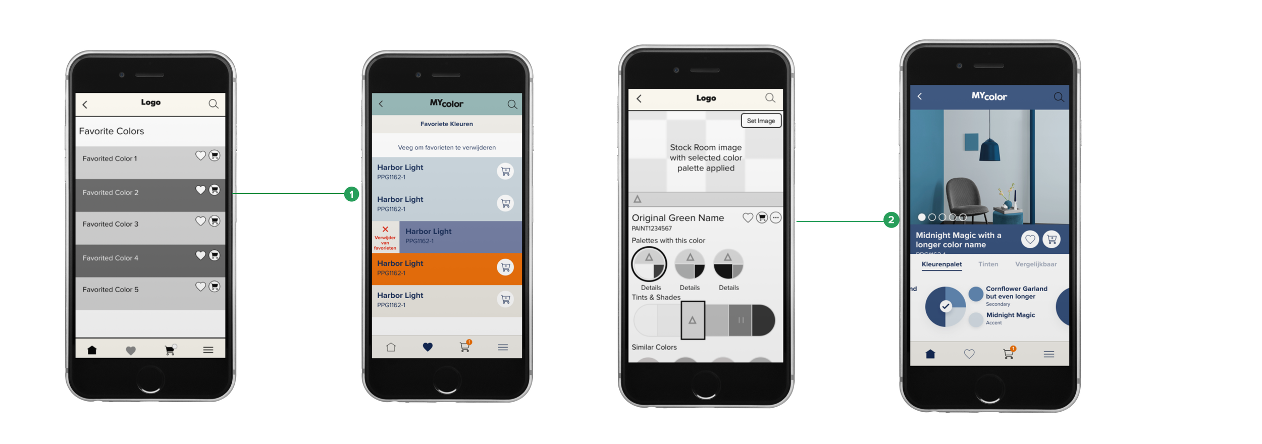
Feeedback : Participants were confused about adding to cart just from favorites and recommend having add to cart button on both color details page
and favorites
There was a bit of a confusion in earlier wireframes, when on favourite color list ‘heart icon’ was designed along with ‘add to cart’ button. In the iteration, we removed the ‘heart icon’ and only kept ‘add to cart’ icon. This made it easier for the users to add colors even from favourite’s screen
‘Add to cart’ button was added also in the color details page along with ‘heart icon’ and more (Ellipsis)

Feeedback : Match page needs clear action button. Also it is not clear to participants that color name was clickable.
First, 2 options are given on the first match photo screen where our users can either click a photo from camera and then choose the color from the picture clicked, or they can upload a photo from their library and then choose a color from the picture accordongly
In the final design we made it very clear that the color in the picture is clickable by 2 ways.
First, by adding a headline on top of the screen which translated in English means ‘ Tap to adjust the color’
Secondly, as it states the users can tap anywhere on the picture and the color name and the color swatch will show the name and the shade of that particular color tapped upon. This is shown by a clickable ‘circular’ icon on the picture which is movable.
RESULTS

Downloads
2,600
App Users
3,285
Color Clicked
2,457
Color Create / Favorite
1,689
Add To Cart
613
Start Checkout
221
Apart from seeing the success of the app with the users in its first version, we also got an opportunity to present this app with our team in Norway and in the Townhall meet which was attended by all our partners, stakeholders, CEO’s, Managers and employees. Designing and launching ‘Histor’ was one of the most anticipated projects of the year. Working on this project also helped in growing our relation better with the stakeholders. ‘Histor’ marked it’s presence as one of the most profitable businesses in PPG.
LEARNING
I was blessed with amazing team for this project. It was an amazing experience to work with such a supportive team and a company that places great value on Research and Design.
Finding the balance: between the business goal and user experience
As one of the UX designer and researcher on this team, the priority goal was to improve user satisfaction with the product. User stories, experiences, and feedback were important to take into account for better design decisions. However, as a UX designer, I also needed to consider and understand the business objectives and constraints because it provided great insights This helped our team to empathize with our end users.
In this project, user experience and business goals go hand in hand. Histor wanted to enhance its business with DIY and DIFM users and conversion/retention rate. And the user's goals are to ease their color painting journey and to know what Histor is about. As a UX designer, I tried to find the best balance between these two goals.
The first thing I did was to understand why solving users’ pain points and the features I designed were important to enhance business goals. This way I could find a balance between them.
Home screens became effective features for increasing conversion rates. Additionally, Matching photo, color creation, personal color finder screens became features for enhancing user experience and achieving the business goals.
Add User Journey of Eric

Though most users noticed heart icon and generally understood it, users often forgot to save colors while others were unsure of its connection to saving. Currently we have a 32% drop-off between customers who view a color details page and customers who save colors. Since this is key to driving to conversion, there is a large value in improving this drop off.
Users started out skeptical about match from photo but were pleasantly surprised and those that adjusted their match color found it easy to do. 34% of users match from a photo.
Dragging the handle across the photo causes the matched colors to flash quickly, overwhelming many users.
Users were excited about palette recommendations with the first generated palette was seen as the most successful, while the second and third generated palettes caused skepticism due to the lack of contrast between colors.
Some users didn’t realize the palettes were clickable and missed the View Palette in Photo feature.