

HISTOR
UX / UI Design for a paint application to improve the color buying experience

My Role
UX Designer and UX Researcher
Tools
Figma, MS Teams, Devops Azure, Mural, and Paper/ Pen
Key Skills
User Research, Feature Analysis, User Persona Creation, Prototyping, High Fidelity Mockups, Stakeholder Presentations and Meetings
Deliverables
Responsive Mobile App
Project Team
2 UX/UI Designers & 2 Researchers, 1 Product Manager,
3 Front End Developers, 1 Backend Engineer, and 1 Scrum Master
Methodology
Agile
Process
DEFINE
Histor - My Color App is a native paint application app of PPG industries in Netherlands and Belgium. It is for the homeowners who are looking to paint their spaces and get omni-channel color experience that will help them to find their colors and drive to the next step in their painting journey.
Challenge
Choosing a paint color for the interiors have always been a difficult task for our users. The choice of choosing a color over a white wall is always time consuming and challenging. In this project, the challenge was to create and produce Histor app for the homeowners which will help them to experience an exciting journey of choosing paint colors for their space and help them ease their painting journey experience.
This project is divided into 3 parts which made it more exciting for us as a team to work on.
Part 1 - Designing and developing Histor V.0 | V.1
Part 2 - Designing ‘Palette of the year’ feature and adding it into Histor app
Part 3 - Improvising on the look and feel of the Histor App
SOLUTION
We designed and provided an omni channel A final set of high fidelity designs of ‘Histor Color Application’ were delivered along with prototypes, well researched plan and usability test results.
We provided Smudg and their customers a unique and clear solution to discover and purchase new products; ultimately helping the beauty enthusiast feel confident about they way look.
DISCOVER
In our discovery phase, before diving deep into our research, we discovered the customer journey and what the users actually need when they choose a color to paint their interiors. PPG partnered with GFK (A marketing research company) who helped us to understand the customer journey of consumers who are interested in Colored wall paint as compared to the one’s who are interested only in White color as their wall paint.
Customer Journey Review
The Color Squad (My Team) and Histor stakeholders reviewed the Customer Journey to understand the needs of our users better
Due to the needs of the customer in their journey, the target customer for the research were determined to be Functionals or Creatives who are looking to paint with color
Discovery Interviews - Session 1

After we got some idea about the customer journey who chose color to paint their walls, we decided to take our next step to understand our users, through Discovery Interviews. The sole purpose of this activity was to understand the challenges and pain points that users face around a painting project in their house. This is how I designed the session for the Discovery interviews
M1 Assumptions
Discovery Interviews were based on some assumptions which we had built as a team. These assumptions were built with our understanding from the market study conducted by GFK.

List Of Assumptions - M1

Here are the list of assumptions we had before interviewing our users. The goal was to see which assumptions from the list can be validated, Invalidated and which will remain Uncertain
Please click here for brief findings
Next Steps
Continue to explore non - validated M1 user assumptions
Create M2 solution- based assumptions
Work with participants to determine potential solution direction with ‘Buy - a - feature’ exercise
Session 2 - Buy A Feature

This activity ‘Buy A Feature’ was conducted so that it could help us prioritize the features for our initial design version. In the end of this activity the features which users valued most were revealed. This activity made it all worth to help us bring closer to create solutions related to our M1 assumptions findings.
Before we jumped into this activity, we made list of our M2 assumptions too, and the goal for M2 assumptions as follows
Feature List
Below are the list of features and it shows how many people prioritized each one

What was guiding their decisions?
Participants were asked for their reasoning behind choosing what they did and if they would be happy with an app with only their selections
Everyone tried to cover each step of their process:inspiration, browsing, narrowing, consideration and ordering with the available features
If each step was addressed, most participants said they would be happy with the tool, even if they had to trade off other features they would
have liked
Most people expected certain features by default to cover core functionality. Because these type of features were lower in price, participants prioritized more delightful features first

Which features did people expect by default?
Most people expected Create Palette, inspirational palettes and trends and saving favourite colors
Only one person expected to order liters by default
Find a Store was seen as the most basic feature to include in lieu of the ability to order colors in some way
Half of the participants expect to see some sort of visualizing functionality
A few people said they expected the brand’s trending colors to be in the app no matter what
2 people said sign in should be default but when asked to elaborate they really expected the app to save their favorite colors and searches, which in an app, doesn’t necessitate having an account
Did they think there were features missing?
For the most part participants thought all bases were covered with a few exceptions
3 people mentioned wanting to order liters
3 people wanted to be able to match or search for competitor colors
One person mentioned wanting a guide or ability to get sundry products they would need such as brushes, rollers, drop cloths, etc depending on their project and substrate
Many people communicated interest in AR visualization capabilities similar to those offered by our competitors
M2 Assumptions
Outcome : Continue validating with prototype evaluations
Findings
Trigger Phase Features
Create your own Palettes / Organize colors for Project
7 out of 9 people prioritized this feature
Most people expected the ability to organize their saved colors based on room/project and create palettes for each one
Wants to view palettes and saved colors in that room type or their room image
People wanted to be able to compare colors and see if they work well together
Ability to move colors around
Display colors on a grid/board
Drag and drop interactivity
A few people wanted to create mood board and upload photos
Some people said they would use this to take photos of furniture, flooring and wallpaper

Personal Color Recommendations
2 out of 9 people prioritized this feature
Most user’s reacted well to getting recommendations
Some expected to get palettes while others expected to get a few main
color choices.
Expects to answer questions to get recommendations
Wanted to be asked about type of room, their style, size of room, lighting, etc.
Expects interior designers and experts to inform color consultation questions
and resultsInterested in science behind color and why colors work together
Some users expected to send in a photo of their room and have a person be in communication with them
• Most people said that this feature would feel gimmicky and untrustworthy if it was a robot, even if well trained
• A few people said they would not use, just because they like to make the color decisions themselves

Inspiration Phase Features
Inspirational Palettes and Trend Collections
4 out of 9 people prioritized this feature
Half of the participants decided to buy this feature
They thought it helps give potential starting points to determining the color for their spaces
Participants view Inspirations and Trends as different but related things.
Trends come out every year and can go out of style
Inspiration can come from anything so it is more evergreen
Trends however can be source of inspiration
Expected a collection of inspirational images and palettes like a magazine or Pinterest
Expected collections or palettes for different types of rooms or decor style
Some didn’t know what the word palette meant in this context

Other feature details are provided below. Please click on the desired feature to know more in depth about the same.
Findings
Painting Projects
Painting looked at as a part of a project rather than a project in and of itself by most participants
5 people recently moved and are making the space their own or are renovating
4 people wanted to refresh or redecorate a room
2 people mentioned extra time due to COVID-19 as a motivator
Level of experience or enjoyment of the painting application process determined if customers determined if they viewed
painting as a task or a chore
Outcome : We now believe our customers view painting as a task
We believe our customers view their project as just a paint project - Invalidated
Visualizing in a Room
All participants want to visualize the color in their room
They mentioned difficulty knowing how colors will look in different lighting
Interested in seeing colors in daylight vs artificial light
4 participants specifically mentioned the Flexa app
2 participants have actually used Flexa app AR visualizer
We believe they settle for interior photos that are not exactly reflecting their own situation - Uncertain
We believe want to see the color in different lighting- Validated
Trends
Participants want a stylish space and use Pinterest for inspiration
Participants start with the color family, keep trends in mind but don’t intentionally keep up with trends
Most participants mentioned getting inspiration and trends from other people’s/neighbor’s rooms
Participants called out that trends and inspiration felt like two different things
Participants are only keeping up with trending colors when they have an upcoming project that includes paint
Outcome : We now believe trends can be a source of inspiration when starting a project
We believe our customers are influenced by trends - Validated
We believe that our customers want to keep up with trending colors - Invalidated
Digital Solutions
Most participants were not aware that digital solutions exist, an app is not their first instinct to find color
Most participants felt comfortable using digital solutions to narrow down their selection before finalizing their choice once in store
2 participants have experience with the Flexa app
Other feature details are provided below. Please click on the desired feature to know more in depth about the same.
We believe they are open to digital solutions - Validated
We believe they will download an app to select color - Validated
We believe they are willing to download an app for their interior project - Validated


Personas
Once we finished our Discovery interviews and findings, we figured out the personas / users of our product. We realized our users are divided into DIFM (Do it for me) and DIY (Do it yourself) types.

This activity ‘Buy A Feature’ was conducted so that it could help us prioritize the features for our initial design version. In the end of this activity the features which users valued most were revealed. This activity made it all worth to help us bring closer to create solutions related to our M1 assumptions findings.
In our discovery / research phase, before diving deep into ‘creating the palette feature’ of the year, we examined the Histor app from where it all started in 2019. Back when the Histor app was developed there
were lot of ideas and conversations around palettes rather than just single colors. Customer research supports this:
Customers think of projects rather than a painting a single wall. This aligns with a concept of 60/30/10.
Most people didn’t understand 60/30/10 palettes initially but benefitted from details provided
Most Participants were interested in curated palettes and style palettes
Half of the participants wanted to save and retain palettes to their favorites


This test was conducted remote and unmoderated in Dutch and our 6 participants (iOS and Andriod users) were all DIY customers in Netherlands who had paint color selection to make within 6 months. Below is the synthesis of our insights:
First generated palettes were successful, while second and third generated palettes caused skepticism due to lack of contrast between colors.The users opinion on palettes relied heavily on the primary color they saw.
A preview of the screens which were tested during the usability testing. Note: All these were V1 of Create a palette feature released in Q2 of 2021
Though most users noticed heart icon and generally understood it, users often forgot to save colors while others were unsure of its connection to saving. Currently we have a 32% drop-off between customers who view a color details page and customers who save colors. Since this is key to driving to conversion, there is a large value in improving this drop off.
Users started out skeptical about match from photo but were pleasantly surprised and those that adjusted their match color found it easy to do. 34% of users match from a photo.
Dragging the handle across the photo causes the matched colors to flash quickly, overwhelming many users.
Users were excited about palette recommendations with the first generated palette was seen as the most successful, while the second and third generated palettes caused skepticism due to the lack of contrast between colors.
Some users didn’t realize the palettes were clickable and missed the View Palette in Photo feature.

Key Research Insight:
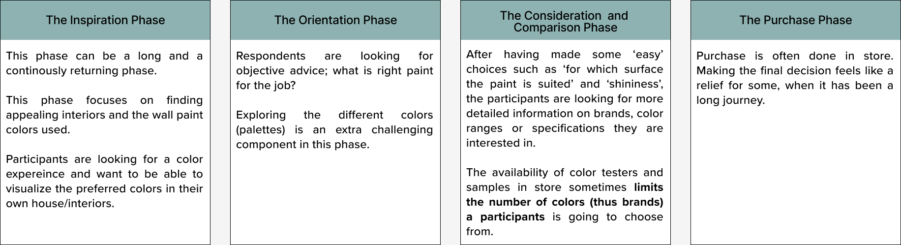
Colour Journey (VS White)
The journey for colored paint is much longer and more complex, especially when it comes to choosing colors who are creating a completely new atmosphere in the house.
Add User Journey of Eric