
PETITE AVE
Redesigning a web solution to decrease drop offs during purchasing stage
My Role
UX Designer and UX Researcher
Project Team
2 UX Designer, 1 UX Researcher / Project Lead
Key Skills
Competitive Analysis, Prototyping, Wireframing, Usability Testing
Tools
Sketch, Adobe XD, Invision, Photoshop, Paper and Pen
Duration
3 Weeks
Deliverables
Website Redesign
Process
DEFINE
The Overview
The Problem
The Deliverables
Petite Ave is a one stop shopping destination (an e-commerce website) for petite sized women. The mission of Petite Ave is to simplify the shopping experience for women under 5'5'' by aggregating petite size clothing from different retailers.
The major challenge faced by the client was that there was high percentage drop off by the customers just before making the purchase. We were asked to find the major reason of customer drop off and design a solution that would cater to the their pain points and overall create a pleasant user experience.
The deliverables decided upon were related to design a smooth checkout process
A chart to show the type of body shape. A guide which helps the user to choose the right kind of design and cuts which is suitable to their body types
Solution showcasing out of stock / availability of the products
Solution to show the shipping cost up and direct as mostly it comes under hidden charges
SOLUTION
A final set of high fidelity designs were delivered along with prototypes, well researched plan and usability test results
Discover
User Persona | Research Methods (Interview, Competitive Analysis, Usability Test, Affinity Mapping, Motivation Factors and Pain Point Factors)
User Persona
Research Methods
User research was quintessential. In order to understand the user needs better, various research methods were used which helped us with great insights to make smooth and hassle free user experience for our users.
Interview
Our start point of the research was by interviewing the CEO of Petite Ave, Vanessa Youshaei. This gave us the basic clarity of some functionalities and needs which the client was looking for. Below are the points and needs mentioned by her during our first meeting with her.
Competitive Analysis
Competitive analysis was done of the other competitor websites which serves petite women. The analysis was done in order to get an insight of the feature sets and the overall user experience. This analysis helped us in figuring out which features are a must have in order for Petite Ave to be a successful brand in the market.
Usability Test and Affinity Mapping
Usability testing was conducted on the current Petite Ave website. This analysis was done in order to get an insight of the feature sets and the overall user experience. This analysis helped us in figuring out which features are a must have in order for Petite Ave to be a successful brand in the market and also there is decrease in the percentage of drop offs.
Due to time constraints we were able to find 4 users who were petite and opted mostly to shop from Petite Ave. Tasks given to each participants were as follows:
Purchase 3 items and put it into the cart
Give an overall feedback on the flow, how intuitive was it to navigate the site
The users were told to voice out their opinion on the overall functionality of the current website
Once the insights were collected, all the points were separated from what was liked vs what pain points each of them faced while performing the task. We created affinity mapping for the following
Motivation Factor
Based on all the research done and insights collected, next we analysed what were the factors which contributed to motivation of the users.
Pain Points
Based on all the research done and insights collected, next we analysed what were the factors which contributed to the pain points of the users.
After the whole research and analysis process was done, we realised the main reasons for the high percentage drop off were the following
Some actions lacked clear system feedback (i.e. adding items to the cart)
Users found difficulty in finding promotions and discount deals of the brands
Shipping costs and policies involved were unclear to the users
Users wanted to know their body type before making the purchase for a good fit
IDEATE
User Goals | Paper Sketches | High Fidelity Mockups
User Goals
In the ideation process we summarized the user goals based on our above research as follows:
User wants to know about the deals and promotions upfront
User would like to get an overview of the total cost in their cart
User would like to know upfront about shipping policies, shipping cost so there are no surprises at the checkout.
Users would like to navigate the website efficiently and shop easily
Paper Sketches
Before designing high fidelity mockups, I did a bit of an ideation through paper wireframes to understand the flow better.
Promotion Banner and Pop - Up
Item Added Notification
Body Shape Information
High Fidelity Mockups
SCREENS : Promotion Banner and Pop Up | Item Added Notifications | Body Shape Information
| Size Chart On The Product Page
Promotion Banner and Pop Up
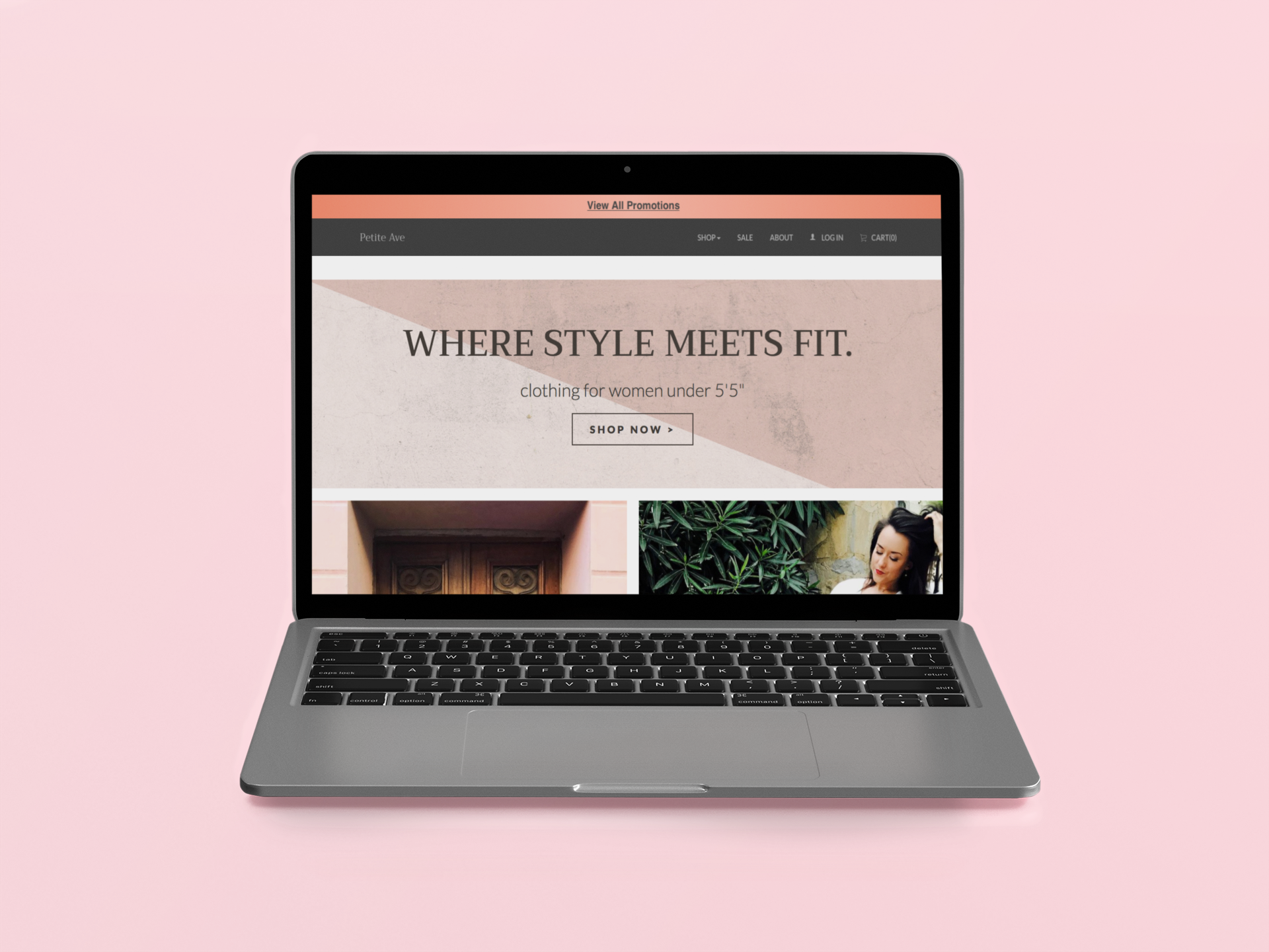
One of the first and major feature which we added to the website was Global Promotion Banner.
This feature was essential for the following reasons:-
Global promotion banner will help the user to view all the promotions and deals on all the brands across the website. This makes it easier and convenient for them to view deals from any page of the website.
While we always wanted the users to be updated with the deals and promotions, we also wanted to not be distracting them from their main focus on the website, i.e 'Shopping / checking out the products'.
We did not want to give a very flashy ad kind of approach to them. Therefore Global banner solution was perfect idea and it also gives a very comprehensive and efficient view to the users without taking away all their attention when they don't need it.
Item Added Notification
A notification window pop up is a feature designed from the cart tab. Whenever an item is successfully added to the cart, a notification window pop ups by letting the users know that their item is successfully added in the cart. This feature is designed for the following reasons:
To create a pleasant user experience having a clear system feedback whenever a user performs an action is crucial and helpful
Informing the users that their items is successfully added in the cart gives them a sense of relief and satisfaction that their actions were received successfully
Important information details like summary of the items, total cost of the items, shipping cost and also how the user is qualified to get a discount all these information is included within the pop-up window
This approach opens up an honest dialogue with the users which helps them to build the trust with the brand and they also get user friendly experience while shopping on Petite Ave
Body Shape Information
A notification window pop up is a feature designed from the cart tab. Whenever an item is successfully added to the cart, a notification window pop ups by letting the users know that their item is successfully added in the cart. This feature is designed for the following reasons:
To create a pleasant user experience having a clear system feedback whenever a user performs an action is crucial and helpful
Informing the users that their items is successfully added in the cart gives them a sense of relief and satisfaction that their actions were received successfully
Important information details like summary of the items, total cost of the items, shipping cost and also how the user is qualified to get a discount all these information is included within the pop-up window
This approach opens up an honest dialogue with the users which helps them to build the trust with the brand and they also get user friendly experience while shopping on Petite Ave

Size Chart On The Product Page
Size chart on the product page gives the customers the size chart guide which is very useful to them while making the purchase of the product.

Other Minor Design Solution Recommendations
In addition to the four major design solutions, we also provided two other minor design recommendations to the client for a smooth user experience on the website. These solutions are as follows:
Adding size chart details on the product detail page
Creating a fixed order on the product page, so that its not random every time if it is refreshed
TEST
Feedback on the new design solution
We saw less confusion and higher shopping experience on the Petite Ave website with the implementation of the new design.
Client Feedback
"Chandani did an outstanding job at providing UX recommendations for my website, Petite Ave. She proposed well-researched ideas which she then tested thru multiple feedback sessions and summarized for me on a weekly basis. I'm excited to implement her recommendations and very confident that it'll lead to higher engagement and conversion rates."
- Vanessa Youshaei - CEO
Project Learning
Working on this project was a great learning curve for me. I got an opportunity to dig up deeply in research areas which helped me to design the solutions. Lot of feedback was given on the regularly basis by our client. Getting feedbacks taught me how to deal with it in constructive way rather than getting defensive, which is usually the case with new designers in the making.
Update
Since this reskin effort, the start up has changed their marketing scope and redesigned their website. However, they still utilized many of our design recommendations and insights for good 1.5 years before changing their scope again.