
SMIOTA
UX / UI Design for package tracking application at every touchpoint
My Role
UX Designer And UX Researcher
Tools
Sketch, Adobe XD, Invision, Paper/ Pen
Key Skills
Onsite Visit , Feature Analysis, User Persona Creation, Prototyping,
High Fidelity Mockups
Deliverables
Mobile App Design
Project Team
2 UX Designers, 1 UX Researchers, 1 Project Manager
Process
This is the process which I followed while starting to work on this project. Following this process was very helpful in every step to carry out this project in the most organized and effective way.

DEFINE
Overview
Smiota is a startup that offers package tracking and storage solutions for colleges, medium to large scale businesses and residential properties. Smiota already has its own web based mailroom application used by many clients. This project is focused on redesigning the application to clarify where the users were exactly in the application while using it, what they were looking at and honing their focus on the task they were at.
Challenge
A central off-site mailroom is needed to intake and then distribute packages to employees in multiple buildings or across campus. In this case we want one of the most prestigious social media company to come onboard.
SOLUTION
A final set of high fidelity designs were delivered along with prototypes, well researched plan and
usability test results
DISCOVER
User Persona | Research : Onsite Visits | Pain Points And Key Findings
User Persona

Research
User research was quintessential, in order to understand the user needs better. Various research methods were used which helped us with great insights to make smooth and hassle free user experience for the users.
Discussion with team mates
I started my first step of research by understanding different ways Smiota was serving its customers. In the end of gaining my knowledge right on the product I ended up finding 6 'configuration types' that Smiota was supporting with other bunch of smaller customization tailored to each client. For this redesign, our purpose was to focus on the overall large scale business configuration.
Onsite Visit
Our team visited our client’s mailroom warehouse to understand their pain points further which gave us a detailed insights and helped us in redesigning our application. All the details and the use cases were observed during the interaction with the staff members. The onsite visit was basically to understand the 'Arrival' to 'Delivery' needs of the user and the current flow which mailroom staff uses.
In order to prepare for our onsite visit, we roughly prepared a set of questions which needed clarifications and were of prime importance in order to understand the overall needs for designing new solution.
Pain Points And Key Findings
Based on all the information we gathered after interacting with the mailroom staff, below are the major PAIN POINTS and KEY FINDINGS from our research process as follows:
Our client was looking for a replacement of BearTracks system (BT)(one of our competitors) because of the poor user interface, and support from BT folks.
User Interface issues include
Unnecessary features clutter up the UI and they are not used by the mailroom staff at all
Drop down does not have a search function which makes them browse 10s of items and results in inefficient usage of associates's time
Due to lack of features in BT system, they use their internal task system for managing part of their delivery process
System is unresponsive at times, specially when receiving the packages for the first time using hand held devices
Users move a lot between building and locations (remote workers travelling to the location, and ordering iphones to take back with them) i.e Users request deliveries to other locations(other than their default location) all the time
A separate staff member handles research activity when Usernames don't match exactly the recipient name OR if there are duplicate names for a recipient. Research person goes between BT, internal directory and internal task sheet many times during the research process.
Alerts is a mechanism through which exceptions are handled e.g.
Employee sends a TASK message that s/he is on vacation
Employee requests the package to be delivered to another person
Employee has other special handling instructions
ALERTS pop up in BT system, when a user is assigned to a package in the system.
Vacation tracking is a manual process for mailroom staff and is not tracked inside BT formally (alerts do popup), so delivery is not attempted. But there is no way for BT to inform that employee is back from vacation, and the package can be delivered.
Chain of custody is maintained through various state changes in the BT system: Received, on the truck, delivered, in the warehouse, etc.
IDEATE
Feature Analysis | Sketch | Style Guide
Feature Analysis
After gathering all the data, I got a clear view as to which features were important to be a part of MVP process. Therefore I started listing down all the important features after analyzing the data which would make a way into the final design solution.

Desktop / Mobile Typescale
Style Guide
I chose to start with a style guide as we had time constraints. Laying out the visual design guidelines from the start was extremely helpful during the design process.


Light Input and Dark Input
Color Scheme
FINAL DESIGNS
Arrival | Receive | Release | Manage | Dashboard And Settings
Package Arrival
The main goal on the package arrival process is getting off packages from the truck and getting into the systems as quickly as possible. In order to achieve this, we designed an interaction that stores the package data locally in the browser and tries to sync to a server on a 2 second interval. This helps the staff to focus on the task of scanning packages quickly and getting into the systems and worry less if they are using the software correctly.
Arrival Flow
Menu Interaction
Receive Packages
Once all the packages are scanned in the system at arrival point, packages are received on web version. In this step, packages can be set on various statuses too, like for example, the package can be set in transit status. Below find high fidelity mockup screens of RECEIVE STANDARD flow according to the needs requested by the users.
Release Packages
Once all the packages are set in different statuses and received successfully, packages are ready to either be in transit mode or in delivered state. Kindly find below how the release module will be seen on the phone screens. Below find high fidelity mockup screens of DELIVERED / RELEASED flow according to the needs requested by the users.
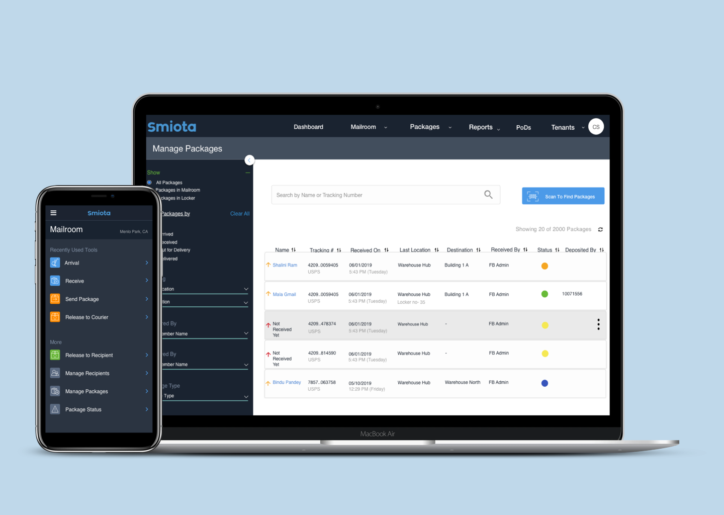
Manage Packages
Under manage package module, packages can be searched and managed based on different filters. This module makes it very easy for the mailroom staff to search any packages as there are daily more than 10,000 packages which are incoming and outgoing. The main purpose to redesign this module is to improve the clarity of where the user was in the app, what it is they were looking at. In the redesign process. we make it easier for the users with scan table rows, modals for focused work and explicit actions.
Dashboard and Settings
Some of the high fidelity mockup screens from the settings section of the mailroom application are shown below
TEST
System Usability Scale Results
System Usability Scale Results
Once all the high fidelity mockups were ready, our users were given the prototype to try out the new design. Kindly find the SUS (system Usability Scale) chart to see how was the new design intuitive and how it was perceived by our users. Though we as a team continuously thought of still working around the solution, we received great positive feedback.
Project Learning
Working on this project was a surely an enthralling journey for me. This was one of the most demanding project during my time in this organization. In the course of researching the mailroom app process at the client’s mailroom warehouse, I came to understand the entire process of how the mails get received to the point of delivery at the desk/doorstep of its employees. I gained lot of knowledge of how mailroom warehouses run.
I also learnt that Collaboration is key. Collaborating with the developers and project manager, I was able to focus on how the users would interact with the new app. Learning the key difference of how the existing app was used vs how the new app would be used was huge. This was possible because we as a team were very passionate of bringing this new design to our users. I worked closely with the project manager to make sure my contributions of the UX perspective were cohesive and easy for the developers to implement the design solutions. We had more work to do based on the requirements of the users. I realised that once we had web application ready, some parts of the process were purely handled on mobile device. Therefore we developed this further into android / IOS app too.
My contract with the company came to an end after working on various projects for a year. We as a team only had 2 months to design and develop this application successfully. The good news is, currently the design is being used by the clients and is running successfully. I feel on cloud nine when I finally witnessed my design being shipped successfully and the company got this huge cherished social media client onboard.